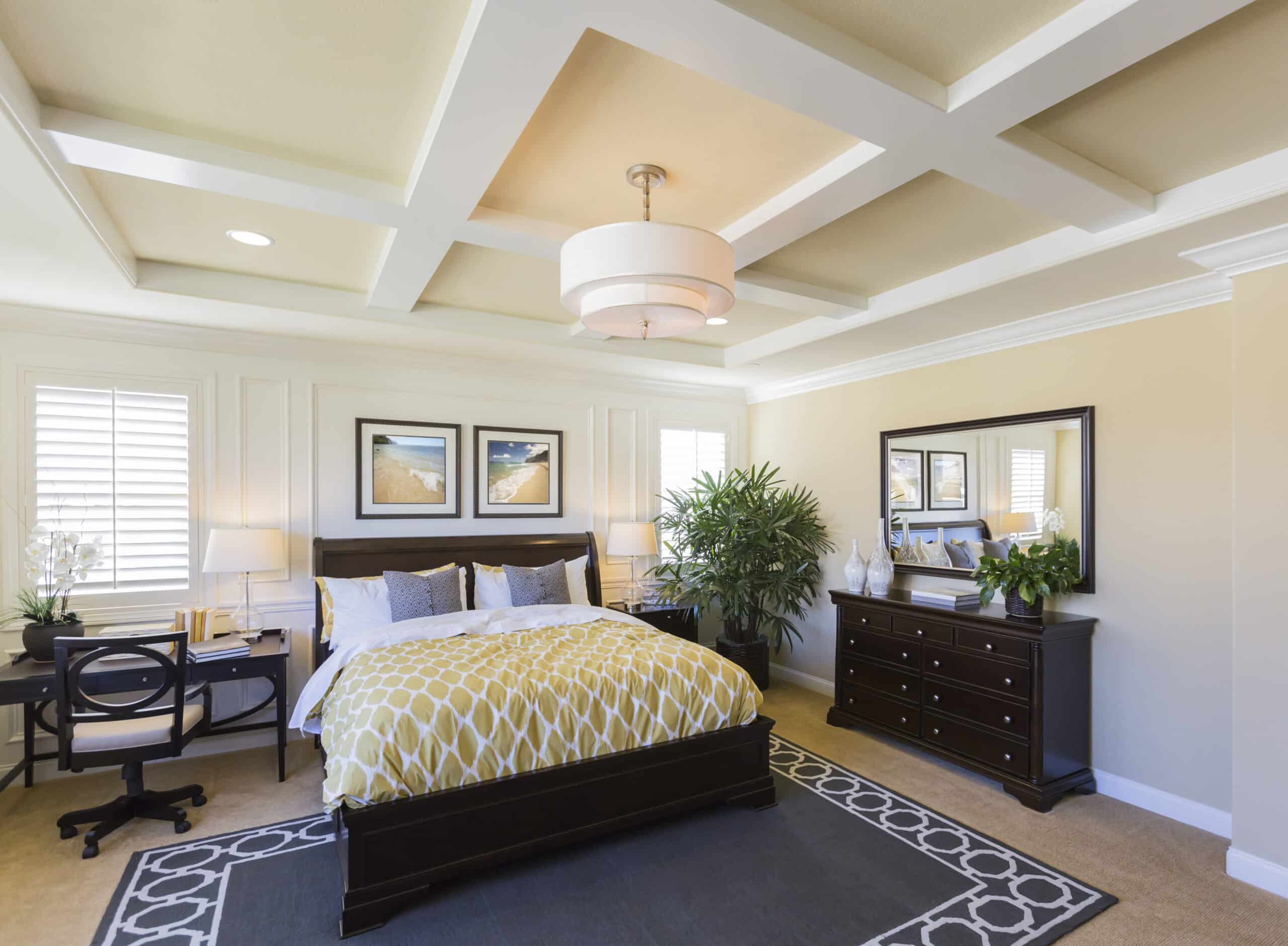
Planning interior house painting in Calgary, AB? The first color is rarely the hard part. Homeowners arrive at that one through a rug, a photo, or a shade they’ve loved for a while. The second color is where most people stall. Two-tone wall color ideas have become standard practice in residential paint projects. Research from Sherwin-Williams involving more than 1,200 homeowners found that 44% of homeowners consider a single accent wall the most effective way to make a space stand out. When nearly half of residential paint projects now depend on two colors working together, the second pick starts carrying serious weight.
What follows walks through why the second color is harder. It covers a tool that shortcuts the decision. It also details the steps a professional painter takes to finish the job correctly.
Key Takeaways
- Pairing a second wall color during interior house painting in Calgary, AB is usually harder than choosing the first one.
- Reliable two tone wall color ideas start with undertone compatibility, not color-wheel opposites.
- Light Reflectance Value sets how each color in the paint color pairing reads once it covers a real wall.
- Skipping peel-and-stick sampling accounts for most paint color pairing regrets.
What Makes the Second Wall Color the Harder Decision
If paint selection feels overwhelming, the numbers explain why. Benjamin Moore’s catalog contains over 3,500 colors. Sherwin-Williams lists another 1,700. Combined, more than 5,000 options await at any paint store offering interior house painting in Calgary, AB. The issue is not a lack of choices. The issue is landing on the right pair.
The first color almost always has a source. A rug in the family room, a tile backsplash, a color used at a friend’s place. The second wall color has no such origin point. It has to complement the first color and serve a specific function within your Calgary light. It has to sit well against your floors and trim. On top of that, it has to look right on its own. Four constraints, all of which need to line up at once.
Image results from any search engine fall short here. Paint captured for a magazine was shot under lighting set up for that specific photo. Calgary daylight runs on its own schedule. Winter sun sits low and pulls warmth from walls by mid-afternoon. Summer light stretches past ten at night. Neither matches the studio where a reference image was taken.
Beyond the mechanics, a specific feeling tends to surface during the second-color decision. It is the sense that a wrong pick means painting the same wall twice. The Sherwin-Williams study found that 28% of homeowners paint without sampling first. That number often gets read as carelessness. In practice, it is a patience problem. After enough fan decks pile up on the counter, another trip to the paint store feels worse than the risk of picking the wrong one.
Every strong paint color pairing begins with the same step: matching undertones before anything else.
Use the Two-Color Planner to Shortcut the Pick
The Two-Color Planner sitting beneath this section was built around three filters professional painters use when sorting through two-tone wall color ideas. The first filter checks that the undertones line up between the two colors. The second targets a Light Reflectance Value gap of 15 to 30 points between them. That range is the planner’s internal setting for keeping the accent wall color distinct from the main color without visually splitting the room. The third filter desaturates every output so the color reads as livable paint rather than a screen swatch.
Already have a color? Find the one that goes with it.
Pick your main wall color below. The planner checks undertones, Light Reflectance Value, and saturation, then suggests four companion colors that actually work on a real wall.
Four Pairings To Choose From
Tap a card to preview it—
—
Preview In Your Space
Main color on the main wall, your pick on the accent wallThe Thinking Behind Each Pairing
Four rules we use to filter out combinations that only work on a screen.Every beige has a hidden pull — pink, yellow, or green. Same for grays. If the two colors lean in opposite directions, they fight on the wall no matter what the color wheel says.
Light Reflectance Value runs 0 to 100. If two companion colors are too close in LRV, they blend together. Too far apart and the room starts to feel chopped up. This planner targets a 15 to 30 point gap.
A color straight off the wheel looks great on a logo and wrong on 80 square feet of drywall. Every pairing here has been toned down so it reads like actual paint, not a digital render.
A north-facing room reads cooler. A south-facing room reads warmer. Same paint can look like two different colors in two rooms of the same home. Peel-and-stick samples cost a few dollars and solve this.
Neighbourhood Painters Can Help You With This Problem
The planner narrows your options. From there, a painter in the actual room finishes the process.
Neighbourhood Painters handles interior house painting in Calgary, AB, and works across the surrounding communities of Airdrie, Cochrane, Chestermere, Bearspaw, and Okotoks. Every estimate includes a conversation about color, folded into the walkthrough rather than billed as a separate visit. A professional painter maps the sun exposure in your room and studies the undertone of your existing hardwood. The sheen on your trim gets checked. The planner’s shortlist is then pressure-tested to see which accent wall color will read correctly in your specific space.
Alberta’s climate also plays into this. Calgary runs dry for most of the year, and temperatures can swing sharply between morning and evening during the shoulder seasons. Before any rollers come out, [company]’s team measures temperature and humidity in each room. Paint applied in the wrong conditions fails in ways that surface weeks later, whether as marks, sheen shifts, or uneven cure. The second wall color you planned around should still look the way you intended at month three, not only during week one.
Before any paint opens, you receive the full timeline in writing. You know the order in which the rooms will be painted, when to move furniture, and when each room is safe to use again. Nothing moves forward mid-project without your sign-off.
Are you stuck on a paint color pairing for interior house painting in Calgary, AB? One conversation with Neighbourhood Painters saves a week of back-and-forth. It can also prevent a full repaint three months out.
Let's Make That Perfect Palette Today
A professional painter reads the details that a screen cannot show. Several variables shift how any accent wall color reads once paint is applied. The sheen on your baseboards. The undertone running through your hardwood. The specific way your window placement throws light across one wall. You do not have to sort through any of this alone.
Interior house painting in Calgary, AB, handled by a team familiar with Alberta’s climate, changes the project. Neighbourhood Painters works across Calgary, Airdrie, Cochrane, Bearspaw, and Okotoks. That local knowledge means the project moves from a shortlist to a finished room without surprises. Call (403) 978-2257 today to book a free estimate with Neighbourhood Painters and move your two-tone wall color ideas off the kitchen table and onto the wall.